A Discussion on Color
"Burple"
Even people who were actually at the races where this car appeared can be conflicted about what color is “right.”
Mark Lavender had this to say:
You tell me! I stood next to the bleeding car, in good sunlight and still don't know what the colour is!
Chris Clark added this:
I even asked David Piper who runs the car today, if he had a paint match or code for the colour and even he didn't know. So what chance have we got ?
That said, some recommend Tamiya TS-57 “Blue Violet” for the Watkins Glen car. Note that there were two “Hippy” cars, one of which was burple and the other was a real blue.
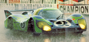
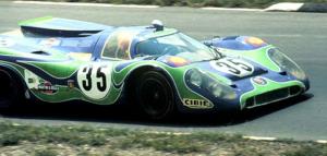
I agree that both cars were blue and green, or more specifically, violet and green. Trying to define the color violet is difficult, as it seems to span a range of pale blue to deep "almost purple" blue. Looking at these cars in their blue-green livery also creates a kind of optical illusion, where the blue takes on a more purplish cast. - kjs
Model Car World also makes a match for the burple car in lacquer. Bottom line on this is, get it close and nobody can really argue the point.
Scale Effect
Others dispute the concept, saying color is color, no matter where it might be. Both camps have valid points.
Scott Truesdell sums it up nicely:
The scale color effect is real.
Ask anyone who picked a color for their house from color chips and when they started painting were horrified to see how oversaturated the color appeared in massive quantities.
It's almost as if your eyes "drink" the color: one shot, no problem; 12 shots and it's "Whew - That's some strong stuff!"
With models it's almost the reverse. What I try to scale is atmospheric haze. Using the exact color looks exactly right if you view it from a 1:1 viewing distance, but if you view at a "model examination" distance the color looks too bright. The scale aircraft and armor guys have been on to this for a while.
The oversaturated effect is exaggerated at certain (wavelengths) colors. One of the trickiest for me is the scale Gulf blue which, due to its wavelength being so close to sky blue, almost always looks too blue close up, even on real cars. I look at a Gulf Ford GT or Porsche 917 in the paddock and think that restorers got it too blue, then I see the same car from 300 meters away on the track and it looks just right.
And don't even get started on the multiple pigment colors like "burple" which seem to dramatically shift color depending on the weather.
So ... I'm just talking here. There is no answer. In Tamiya's book he talks about tweaking proportions to match 1:1 perceptions. The subject is endlessly debatable. But in the end, I consider building these models (as opposed to actual design prototypes) to be "art" and, as an artist, I'll build it so it looks good to me.
As do we all.
Contributors:
Chris Clark. All images Copyright ©2006 Michael Hanson.